Thinking Designer: A Modern Display Font for Digital Branding
There it was—my client’s new coaching website hero section, half-built in Figma, with a placeholder headline that just felt… flat. “Clarity Starts Here.” Solid message. Weak delivery. I swapped in Thinking Designer, adjusted the letter-spacing to 40, and watched the entire tone lift—not louder, but sharper, more intentional. That’s when I knew this wasn’t just another decorative font. It’s a quiet confidence booster for digital interfaces.
A Tall, Thoughtful Presence on Screen
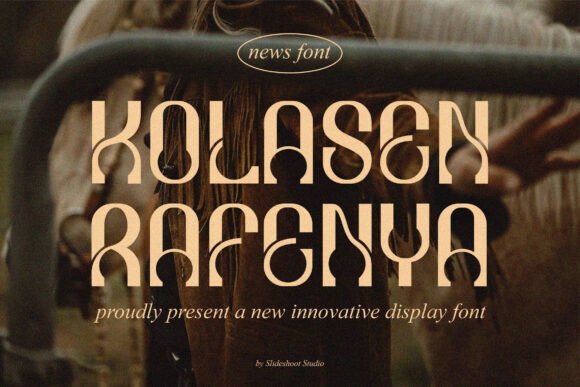
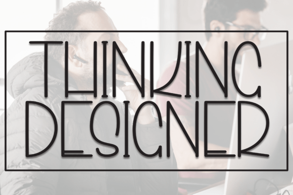
Thinking Designer is a narrow display font built for impact without shouting. Its tall x-height, clean geometric curves, and subtle terminal flares give it a modern, almost architectural presence—like a well-designed UI component that earns attention through precision, not volume. It doesn’t try to be friendly or playful; instead, it feels intelligent, curated, and quietly authoritative. In practice, that translates to hero headlines that land cleanly on desktop and scale gracefully on mobile—especially when paired with generous line height and thoughtful spacing.
Where It Shines (and Where It Steps Back)
I tested Thinking Designer across real layout scenarios: a boutique online store banner, a course sales page CTA, a portfolio project title, and a blog post header over a subtle gradient. In every case, it elevated the hierarchy instantly—drawing the eye first, holding attention longer, and reinforcing brand tone before a single word is read.
But—and this matters—it’s not a workhorse. I tried using it for navigation labels at 16px. Too tight. Too narrow. The legibility dipped, especially on lower-DPI screens. Same for form field placeholders or small footer links. Thinking Designer is a display font, full stop: best reserved for short, high-impact text—headlines under 8 words, section titles, button copy (“Get Started”), logo lockups, and branded graphic elements like quote cards or testimonial banners.
For body text, I paired it with Inter (a highly legible, open-source sans serif) and saw immediate harmony: Thinking Designer sets the tone; Inter delivers clarity. No competing personalities—just complementary roles.
Responsive Behavior You Can Trust
One of my biggest concerns with narrow display fonts is how they behave on smaller viewports. Does the tall proportion become awkward? Does tracking collapse unpredictably? With Thinking Designer, the answer is reassuringly no—if you respect its rhythm. At 320px width, I dropped the font size from 48px to 36px, increased letter-spacing to 50, and kept line-height at 1.3. It held its elegance without crowding. Even over a busy image background, its contrast and structure made it scannable—not fragile.
On dark mode previews, it performed equally well. The clean outlines and open counters prevented visual “mushing,” and its consistent stroke weight meant it didn’t disappear against deep backgrounds. Just avoid ultra-thin weights if your site supports older browsers or low-end devices—stick with Regular or Medium for maximum reliability.
Practical Considerations for Real Projects
Before dropping Thinking Designer into a live site, I checked three things: webfont formats, licensing, and stylistic options. It includes WOFF2 (ideal for performance), comes with a commercial license that covers client sites and SaaS platforms, and offers OpenType features like standard ligatures and alternate characters—subtle but useful for polishing a headline or avoiding awkward letter collisions (like “f” + “l” or “T” + “o”).
No italics or bold variants—but that’s by design. This isn’t a text family; it’s a focused display tool. If your layout needs emphasis beyond size or color, use weight shifts in your pairing font instead of forcing Thinking Designer into roles it wasn’t built for.
I also verified multilingual support. It covers Latin-based languages thoroughly—including accented characters used in French, Spanish, and German—so it’s safe for bilingual landing pages or global-facing brand kits. No surprises at launch.
Pairing It With Purpose
What makes Thinking Designer feel so effective in digital contexts isn’t just its own personality—it’s how easily it plays well with others. For clean, tech-adjacent brands, pair it with a neutral sans like Inter, Poppins, or Manrope. For editorial or creative studios, try a refined serif like Lora or Playfair Display—just keep body sizes generous and line heights relaxed to avoid visual tension.
Avoid pairing it with other narrow or overly decorative display fonts. And skip script fonts unless you’re going for deliberate contrast in a very controlled context (e.g., a single hand-lettered accent word beside a Thinking Designer headline). Simplicity is its superpower.
Final Layout Notes You’ll Appreciate
When exporting assets or prepping for developer handoff, I found Thinking Designer rendered consistently across Chrome, Safari, and Firefox—no unexpected kerning jumps or rendering hiccups. Its hinting is well-tuned, and it loads quickly when served via a reliable CDN.
For SVG-based illustrations or branded icons, I used it as inline text within the SVG code—and it scaled flawlessly at any resolution. And for social media graphics generated dynamically (like blog post previews), its distinct shape made thumbnails instantly recognizable in a crowded feed.
It won’t solve weak content or poor UX flow. But when your message is strong and your layout is intentional, Thinking Designer becomes the quiet, confident voice that helps users pause, understand, and trust—before they even scroll down.