Bolder Alphabet: A Playful Display Font for Digital Branding
Yesterday, I dropped Bolder Alphabet into the hero section of a new landing page for a children’s creative workshop—and everything clicked. Not just visually, but emotionally. The thick, confident strokes instantly anchored the headline. That playful outline detail? It didn’t just sit on the screen; it *popped* against the soft pastel background, adding dimension without clutter. As a UI designer who spends hours fine-tuning typographic hierarchy, I don’t say “everything clicked” lightly.
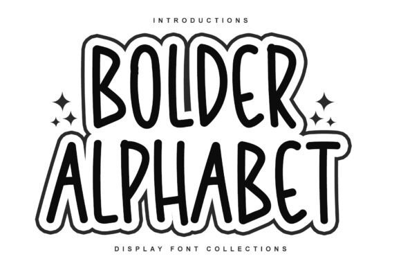
Bolder Alphabet is a display font built for presence—not subtlety. Its strokes are generously weighted, its curves friendly and open, and its outline treatment gives it subtle texture and depth. It’s not trying to be neutral. It’s designed to energize, invite, and signal joy—without sacrificing clarity. That makes it especially effective in digital spaces where attention is fleeting and tone must land in under two seconds.
I tested it across real layout scenarios: a boutique online store’s seasonal banner, a coaching website’s “Get Started” CTA button, and a portfolio homepage’s project title cards. In each case, Bolder Alphabet worked best when used sparingly and intentionally—never for body copy, always for impact. On mobile, it held up surprisingly well at 32px and above, especially with generous letter spacing (I used letter-spacing: .05em in CSS). At smaller sizes or in tight buttons, it softened slightly—but that’s by design. This isn’t a utility font. It’s a spotlight font.
For readability, contrast matters more than ever. On light backgrounds, Bolder Alphabet shines with crisp definition. Over image banners, I added a subtle semi-transparent overlay behind the text—or used a soft drop shadow—to ensure legibility without masking its character. On dark mode interfaces, I paired it with a lighter weight of the same font family (if available) or opted for a clean white fill with minimal stroke offset. No tricks—just thoughtful layering.
Where does it truly earn its place? In hero headlines, section dividers (“What You’ll Learn”, “Meet the Team”), campaign slogans, and social media graphics exported from Figma. I used it for a course sales page’s main value proposition (“Build With Confidence”) and watched how it guided the eye before users even scrolled. It also works beautifully in logo lockups for brands that want approachability with authority—think makerspaces, indie toy shops, or family-focused SaaS tools.
But here’s what I appreciate most as a web designer: Bolder Alphabet doesn’t ask you to compromise usability for personality. Its letterforms are open and generous—no cramped counters or ambiguous shapes. The uppercase ‘A’, ‘R’, and ‘G’ are distinct even at small viewports. Lowercase alternates (when included) add charm without confusion. And because it’s built as a modern display font, it renders cleanly across browsers and supports common Latin-based languages—essential for any public-facing site or digital brand kit.
Font pairing is where Bolder Alphabet really sings. I consistently paired it with a warm, highly readable sans serif—like Inter, Poppins, or Manrope—for all body copy, captions, and navigation. That contrast creates rhythm: bold energy up top, calm clarity below. For a more editorial feel—say, on a blog redesign or creative agency site—I swapped in a gentle serif like Lora or Cormorant Garamond for subheads, letting Bolder Alphabet remain the sole expressive voice in the hierarchy.
Before deploying it live, I double-checked three things: First, whether the webfont version was optimized for fast loading (it was—WOFF2 included). Second, whether the license covered commercial use on client sites and SaaS platforms (yes—it’s a commercial font with clear usage terms). Third, whether stylistic alternates or multilingual glyphs were part of the package (they were, including extended Latin support). These aren’t afterthoughts—they’re part of responsible typography stewardship.
In practice, Bolder Alphabet helped unify a fragmented visual language across one client’s assets: their Notion course templates, Instagram story highlights, email headers, and product landing page. Consistency wasn’t forced—it felt earned. Users didn’t just notice the typeface; they associated it with the brand’s warmth and intentionality. That’s rare for a display font.
It’s also worth noting what Bolder Alphabet isn’t meant for. Don’t use it in dense paragraphs. Avoid stacking multiple weights in one section—it’s strongest as a single, confident statement. Skip it for data tables, form labels, or accessibility-critical interface text. Its role is expressive, not functional—and honoring that boundary is what makes it effective.
As digital spaces grow noisier, our choices in typography carry more weight than ever. A font like Bolder Alphabet reminds us that playfulness and professionalism aren’t opposites—they’re collaborators. When your audience lands on a page, you have milliseconds to communicate trust, clarity, and care. Sometimes, that starts with a single, bold letter—and how thoughtfully it’s placed.
If you're building a portfolio site, launching a new course, refreshing a small business website, or designing social-first campaign assets, consider where a display font with heart and heft could elevate your message—not drown it. Bolder Alphabet won’t solve every design problem, but in the right context, it makes the solution feel joyful, intentional, and unmistakably human.