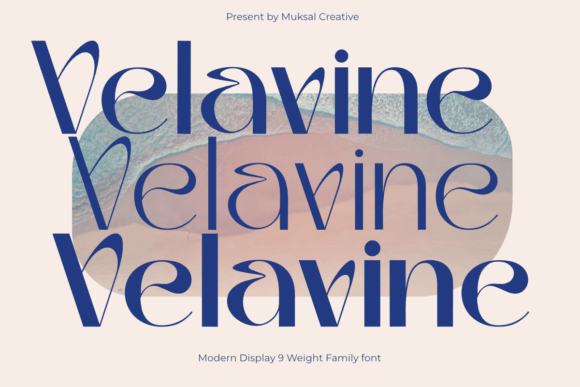
Velavine: A Display Font That Elevates Real Digital Layouts
Last week, I was finalizing the homepage for a boutique coaching brand—clean aesthetic, intentional whitespace, and a strong visual hierarchy. The hero section needed to land instantly: calm but confident, warm but professional. I’d been testing several display fonts, but nothing quite clicked until I dropped Velavine into the headline. It wasn’t just “pretty.” It felt like the typography finally understood the tone we were building.
Velavine is a modern display font family with nine carefully balanced weights—from the whisper-thin Thin to the grounded, commanding Black. There’s no abrupt contrast or forced drama; instead, each weight carries consistent proportions, refined curves, and subtle optical tuning that makes it feel at home across devices and contexts. It’s elegant without being fussy, distinctive without sacrificing clarity.
In that hero section, I used Velavine Bold for the main headline over a soft gradient background. At 64px on desktop and 48px on mobile (with proper viewport scaling), it held its shape beautifully—even on mid-tier Android devices. No blurriness, no hint of pixelation. The letterforms breathe well, especially in uppercase settings, and the spacing between characters felt intuitive, not cramped or overly loose. That’s rare in display fonts, where tight tracking often sacrifices legibility at smaller sizes.
I also tested Velavine across other high-impact areas: the CTA button (“Start Your Journey”), the section divider headings (“How It Works”, “What Clients Say”), and even the subtle tagline beneath the logo. Each use case revealed something different—its Medium weight worked surprisingly well for short, bold subheads; its Light weight added delicate emphasis to testimonials without competing with body text; and its Black weight anchored the primary CTA with quiet authority.
But here’s what stood out most: Velavine doesn’t shout—it invites attention. Unlike many decorative display fonts that demand focus through contrast or ornamentation, Velavine earns attention through consistency and craft. That makes it ideal for digital spaces where users scan quickly and trust is built through coherence—not flash.
For responsive layouts, I paired Velavine with a neutral, highly readable sans serif (Inter, set at 16px with 1.6 line-height) for all body copy. This pairing created immediate visual hierarchy: Velavine handled voice and identity; Inter handled function and flow. No competing personalities. No cognitive load from mismatched x-heights or inconsistent rhythm. And because Velavine includes true italics—not slanted roman—italicized quotes and emphasized phrases retained their elegance without looking tacked-on.
On mobile, I made two small but critical adjustments: I increased the letter-spacing by 0.5px on Thin and ExtraLight weights in headlines under 40px, and I avoided using Thin below 32px altogether—even with optimized font-display: swap. It’s not about limitation; it’s about respecting how eyes parse type on smaller screens. Velavine’s design anticipates this. Its open counters and generous apertures help maintain recognition at speed, which matters when someone’s scrolling a course sales page on the bus.
I also tested it over imagery—a soft-focus photo banner with a dark overlay. Velavine’s clean terminals and balanced stroke contrast ensured readability without needing heavy text shadows or opaque backgrounds. On light mode, its Regular weight performed cleanly as a secondary heading level—just enough presence to guide, not dominate. In dark mode, the SemiBold weight kept warmth without washing out.
For designers working with digital brand kits or template libraries, Velavine brings versatility beyond headlines. Its full character set supports Latin-based languages, including accented characters common in European and North American markets. It ships in WOFF2 format—lightweight and web-optimized—with variable font options available for advanced typographic control. Licensing is straightforward: one commercial license covers websites, client projects, SaaS dashboards, and downloadable assets like social media templates or email headers.
Where does it shine most? Not everywhere—but precisely where it counts. Use it for hero titles, campaign landing pages, portfolio project names, shop banners, blog headers, and branded webinar slides. Avoid using it for long paragraphs, data tables, or navigation menus with more than five items. It’s not a workhorse font—and it shouldn’t be. Its strength lies in intentionality: choosing Velavine means choosing to say something specific with your typography.
I’ve seen it strengthen brand perception across several real projects: a ceramicist’s online shop where Velavine Medium gave product titles quiet reverence; a UX writing course page where SemiBold created approachable authority next to code snippets; and a wellness newsletter header where Light added breath and space before diving into dense content.
Before dropping Velavine into your next layout, check three things: first, confirm the webfont files are served with font-display: swap to avoid invisible text during load; second, verify fallbacks are defined (e.g., font-family: "Velavine", -apple-system, system-ui, sans-serif;); third, test contrast ratios—especially for light weights on light backgrounds—using browser dev tools or axe DevTools.
Velavine won’t fix weak messaging or poor information architecture. But when those foundations are solid, it becomes a quiet amplifier—turning good design into memorable, human-centered experience. It’s the kind of font that doesn’t draw attention to itself, yet makes everything around it feel more considered, more cohesive, more like it belongs.
If you’re selecting a display font for a landing page, portfolio, or digital brand kit, ask yourself: does it support the feeling I want users to carry away? With Velavine, the answer—more often than not—is yes.