Neapolis: A Modern Sans Serif Font for Digital Clarity
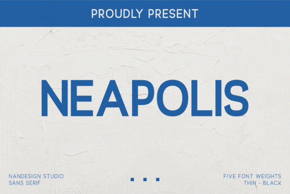
As a UI designer who ships landing pages, SaaS dashboards, and e-commerce experiences, I choose fonts not for their aesthetics alone—but for how they behave in real layouts. Neapolis stands out because it’s built for the screen first: clean, legible at small sizes, and expressive without sacrificing neutrality. It’s a premium sans serif font family with five distinct weights—Thin, Light, Regular, Medium, and Bold—each carefully tuned for optical consistency across devices.
What makes Neapolis work so well in digital interfaces is its intelligent proportioning. The x-height is generous but not overwhelming; counters are open; terminals are subtly flared—not enough to call attention to themselves, but enough to guide the eye smoothly through text blocks. That balance means Neapolis performs exceptionally well in both hero headlines and body copy on responsive websites—especially when paired with a light or medium weight for subheadings and the Bold weight for CTAs that need visual urgency.
In practice, I’ve used Neapolis across a range of projects: a boutique skincare brand’s online store (where its restrained elegance reinforced premium positioning), a coaching platform’s sales page (where the Medium weight created clear section breaks without shouting), and a portfolio site for a motion designer (where Thin and Bold were layered for contrast in project titles and captions). Its personality sits confidently between warm minimalism and quiet authority—never cold, never fussy.
For readability on mobile, Neapolis shines. At 16px on iOS Safari or Chrome Android, the Regular weight maintains crisp rendering even without custom hinting—thanks to its high-quality vector outlines and thoughtful spacing. On dark mode interfaces, it holds up beautifully: no haloing, no loss of distinction between weights. When overlaid on subtle image backgrounds or gradient banners, the Bold weight delivers strong contrast without needing text shadows—just solid color choices and proper letter-spacing adjustments.
Visual hierarchy is where Neapolis truly earns its place in your design system. Because the five weights share consistent width and rhythm, scaling from Regular to Bold doesn’t disrupt layout flow. You can set H1s in Bold, H2s in Medium, and body copy in Regular—all without reflowing containers or adjusting line-heights drastically. That predictability saves hours in responsive QA. For conversion-focused layouts—like pricing tables or feature grids—I use the Light weight for supporting descriptors and Bold for key differentiators. It creates a natural scanning path that guides users toward decisions, not away from them.
Neapolis isn’t meant to be a logo font by default—but it works exceptionally well as one when simplicity and timelessness are core to the brand identity. I’ve implemented it as primary logo type for two B2B startups: one in fintech (using Bold with tight tracking), another in sustainability software (using Thin for a delicate, forward-looking tone). In both cases, the font scaled cleanly from favicon to billboard-sized web banners—no redrawn versions needed.
Font pairing is intuitive. For editorial or content-heavy sites—think blogs, course platforms, or knowledge bases—I pair Neapolis Regular with a warm, low-contrast serif like Cormorant Garamond or Literata. The contrast gives structure: Neapolis handles navigation, headlines, and UI labels; the serif brings warmth and narrative pacing to long-form text. For more technical or data-driven products, I often pair Neapolis with a monospace (like JetBrains Mono or Fira Code) for code snippets and data labels—creating a cohesive, trustworthy tech aesthetic.
It’s also versatile beyond the browser. I’ve used Neapolis in social media graphics, email headers, and digital ad creatives—always exporting as outlined vectors or using variable-weight webfonts via @font-face. The family includes standard OpenType features: true small caps, discretionary ligatures, and localized forms for extended Latin and Greek characters. Multilingual support covers Western, Central, and Eastern European languages—critical for global SaaS products or international e-commerce stores.
When embedding Neapolis into production, I serve only the weights and character sets actually used—no unnecessary WOFF2 bloat. For client projects, I confirm commercial licensing covers web use, embedded PDFs, and digital templates. Most licenses include desktop use for design files and web use for live domains—essential for agencies delivering full brand kits or developers building white-labeled dashboards. Always verify whether the license permits usage in hosted tools (e.g., Figma plugins or Notion templates) if you’re packaging Neapolis into reusable design assets.
One practical note: avoid using the Thin weight below 20px on desktop or 18px on mobile for body copy—it’s designed for emphasis, not extended reading. Reserve it for decorative accents, subtle captions, or minimalist taglines. Likewise, the Bold weight gains maximum impact when given breathing room: use ample line-height (1.4–1.6) and generous letter-spacing (0.5–1px) in hero sections to let its structure breathe.
Whether you're designing a single-page product launch, refreshing an online store’s typography system, or building a brand identity kit for a creative entrepreneur, Neapolis delivers consistency without compromise. It doesn’t distract—it clarifies. It doesn’t shout—it invites. And in today’s crowded digital landscape, that kind of quiet confidence is rare, valuable, and deeply effective.
If you’re evaluating fonts for your next digital project, ask yourself: does this typeface support the user’s journey—or interrupt it? With Neapolis, the answer is consistently yes.